SKILL UP
Can design matching energy of the drink.
.webp)
HYPNOTISING
CAN DESIGN
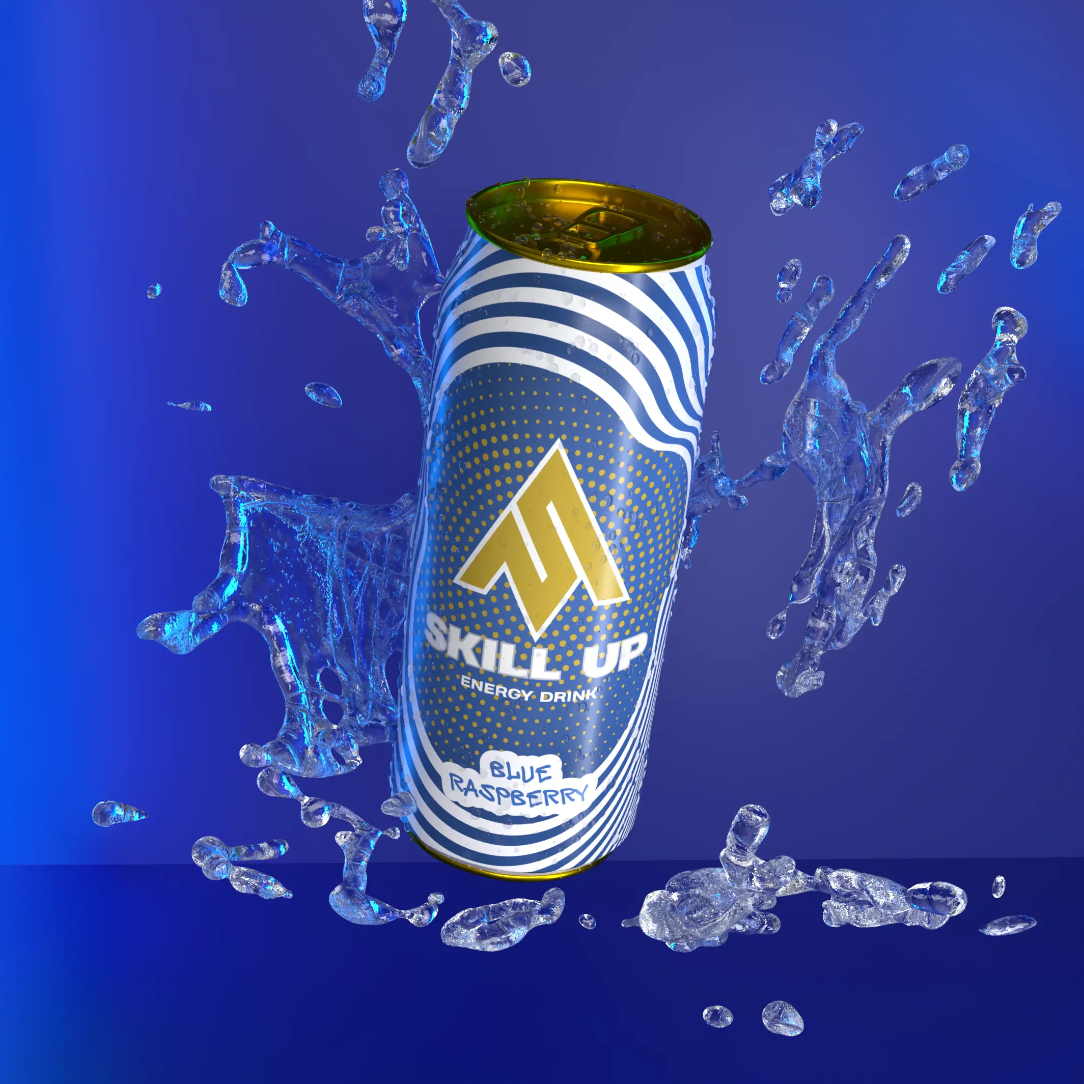
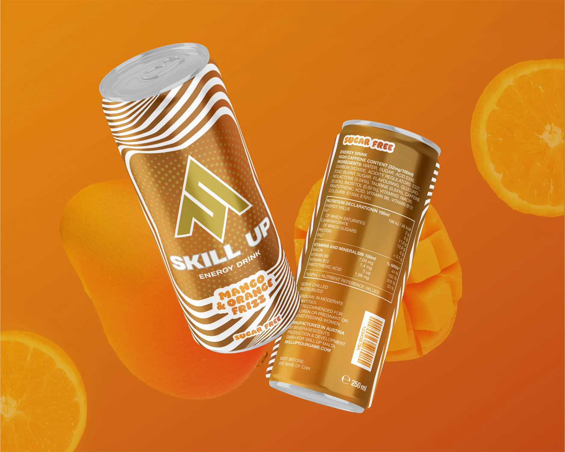
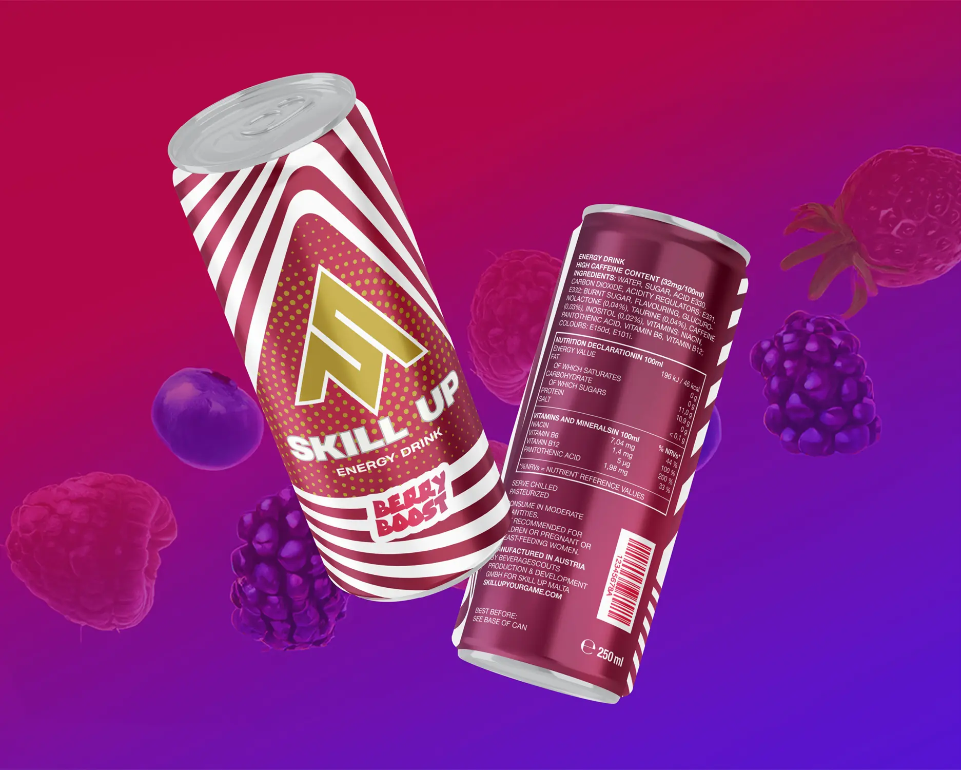
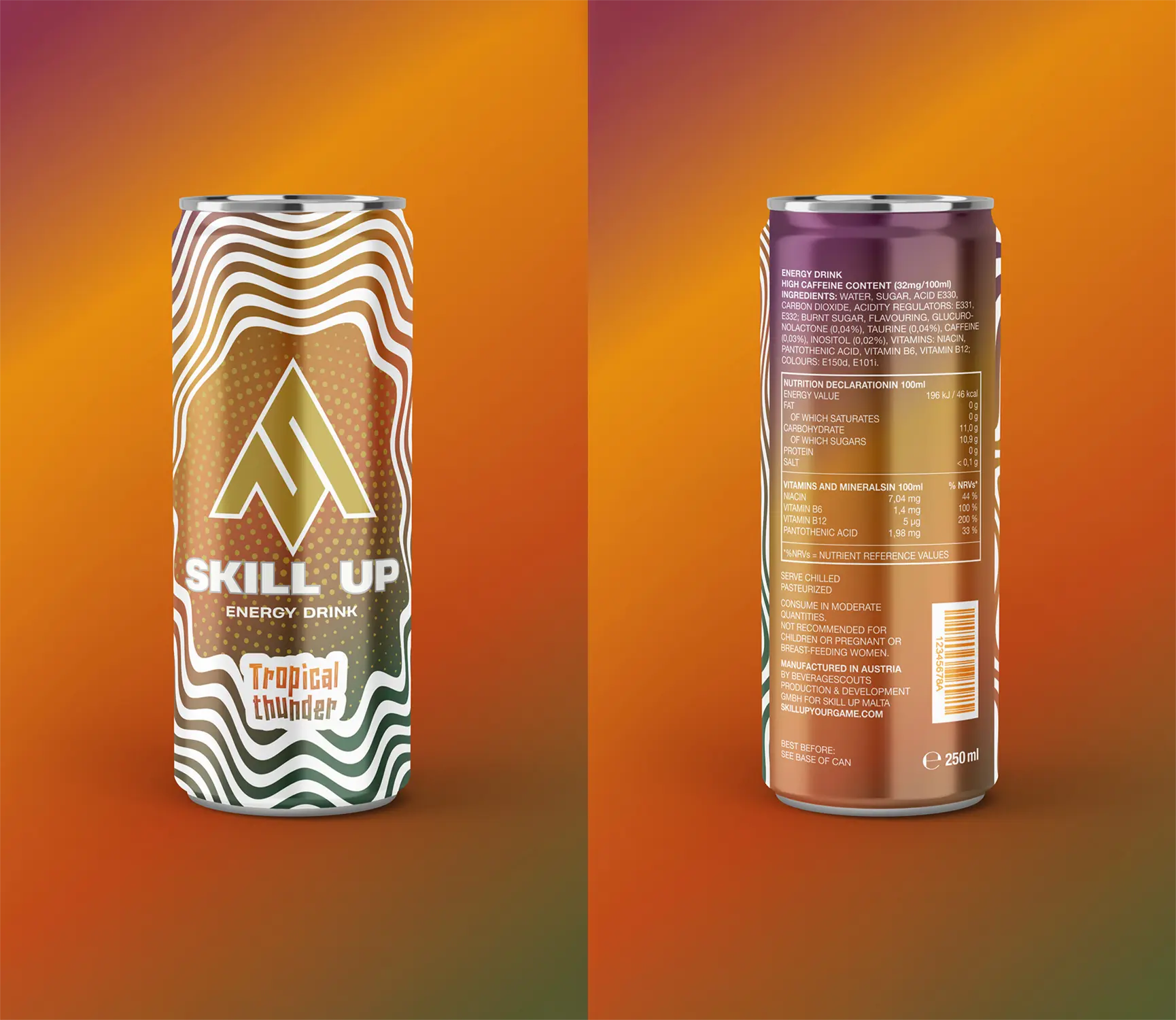
SKILL UP approached us with a challenge to design packaging for four new energy drink flavours that would expand the brand beyond its signature black “Original” can. The goal was to create a visual identity that felt fresh, dynamic, and unmistakably part of the SKILL UP collection.
We developed a coherent system of designs that introduced new color territories for each flavor - blue, tropical, orange, and red-purple. While maintaining a strong connection to the existing brand. Each can become a distinct expression within a unified visual language.
The key design feature is an irregular wave pattern inspired by energy pulses. From its center radiates an empty space reserved for the logo and typography, creating both structure and movement across the surface.
This hypnotic, wave-driven design captures the essence of SKILL UP, the bold taste, visual energy, and a strong, instantly recognizable brand presence on the shelf.